You may have read a previous article of mine (Greek), here on SZ1A, about skimmers. How do we put all this into practice? How will this technology be useful in our daily lives? How can we, using the spotlights detected by the skimmer, assess and evaluate the propagation conditions for our station? Here are the answers ….
Several of you have used or seen up close the remarkable CW SKIMMER software by Alex Shovkoplyas – VE3NEA [1]. Combine it with an SDR receiver and it can detect CW QSO in an entire amateur radio band or even in more than one! In order to help colleagues (such as to assess the performance of their antennas), the data – spots can be uploaded online to the Reverse Beacon Network – RBN [2] by use of RBN Aggregator software. It is worth noting that Aggregator records the spots it receives from CW SKIMMER in a local text file as well. At the same time, the RBN website provides a table – list of several of the spots that have been uploaded from a particular SKIMMER station, along with their representation as pins on a world map (two dimensions). Same results occur by running ViewProp [3] and DX Atlas [4] locally, even on the same computer that CW SKIMMER is running. Unfortunately, the maintenance and evolution of ViewProp seems to have stopped for some time. Its capabilities for visualizing and filtering spots are also limited.


Having set up all of the above in the shack and making round-the-clock use for several consecutive days, a relatively large log file is created with spots which could be exploited somewhat more. What questions could the data answer? Definitely show the time of day with most CQ calls, and with some filtering, from specific geographic areas. Useful for someone who aims to do DX – contest or just ragchewing.
Of course, similar information is also apparent from the study of ionospheric propagation. But the models used there usually consider an ideal QTH, with perfect antennas & receivers as well as enviable takeaway angles. And of course, nowhere does the human factor exist, as in QRV availability of operators on working days or on holidays.
On the same train of thought, how does the propagation (spots) are affected with solar – geomagnetic phenomena, for example Coronal Mass Emission – Geomagnetic storm. Are openings created or vice versa? Lastly, if someone can’t be over the transceiver for 24×7, wouldn’t they want to find out when they heard a DXPEDITION or generally what their station has received?
Processing data from the log file filters spots into four geographic regions, North America (NA) – South America (SA), Japan (JA) and Australia (VK). Grouping is based on prefix and the name is indicative. In more detail, NA contains spots from Panama to Alaska, and SA from Venezuela to Colombia to southern Chile, for JA besides Japan Korea (CQ zone 25) is included. Finally, the VK has Australia, New Zealand and islands from CQ zones 29, 30, 32. In addition, two more regions have been created, one for DX – outside Europe spots and another for all without exception.
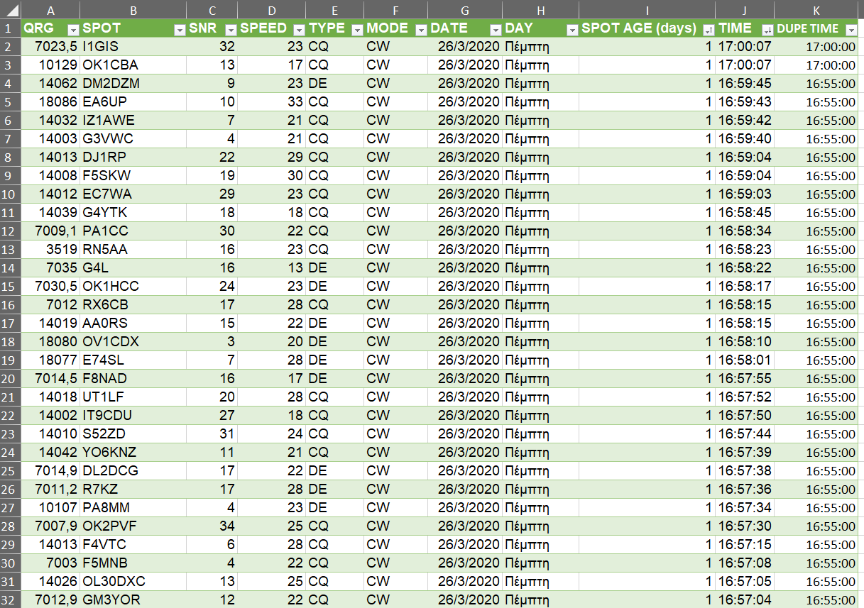
Fields stored are QRG – SPOT CALLSIGN – SNR – SPEED – TYPE (CQ/DE) – MODE – DATE – DAY – TIME. AVAILABLE MODES are CW and FT8 (via the Aggregator’s connection to WSJT-X[5]). Type CQ refers to spots that call CQ, while DE those that answer a call or QSO. Because of the large amount of data, only those for the last 90 days are held. Moreover, repeating spots (same CALLSIGN) within a 5-minute period of the same day are stored only once, in order to limit DUPE stations that call continuously.
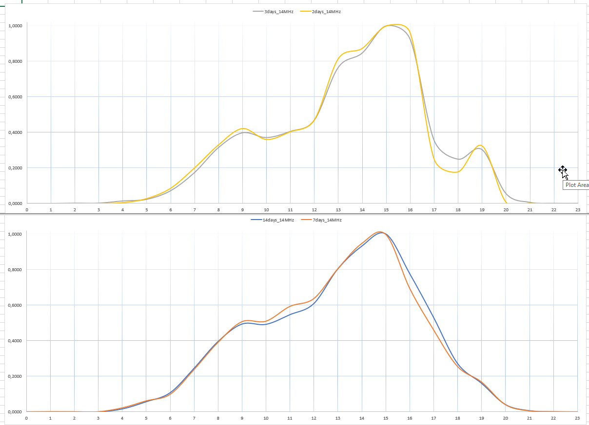
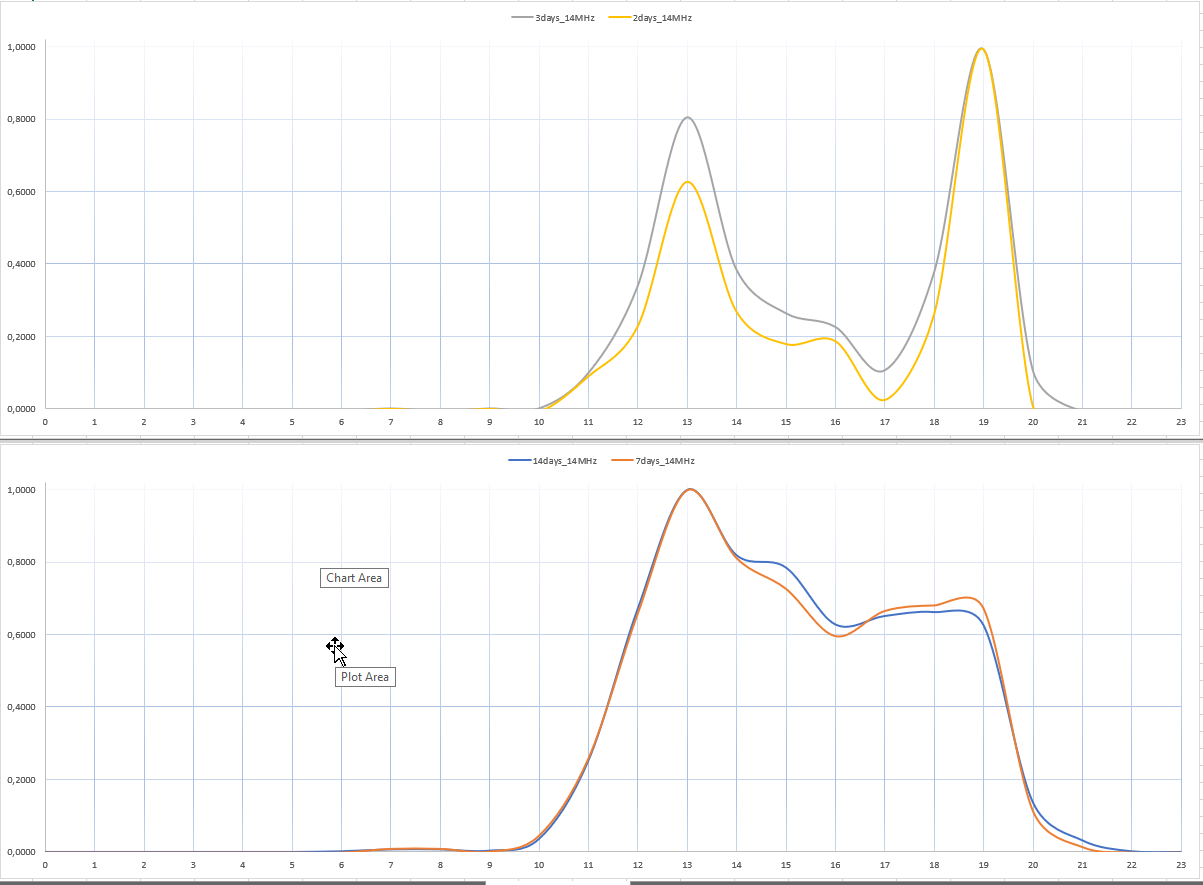
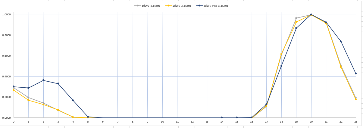
The tool that performs all of the above functionality is Microsoft Excel. For each region, the pivot tables produced contain the number of spots per hour. For example, North America tables have twenty-four lines, one per hour, along with how many CQ/DE SKIMMER heard for each hour. In addition, there are tables that group this number by totaling it for the last 2 – 3 – 7 – 14 days from the time the data is processed. Before the results are depicted on a chart they are transformed, normalizing (min-max type) the count for each group of days. This way their comparison is more efficient and easier, since the number of spots has values between 0 (none) up to 1 (maximum). So, the end product with highest user consumption, the charts, show on the horizontal axis UTC time from 00 to 23, and on the vertical normalized number of spots from 0 to 1. For each geographic region and band there are four charts, one for each group of days (2-3-7-14), with a different curve color (indicators are at the middle top of the chart). Excel draws the line between the graph points (UTC time & normalized spots pair), not as straight, but with its own algorithm called smooth line. The result is a more curved line, somewhat better accepted for visual evaluation.
Particular attention should be paid to the fact that while the points on the chart have a value per integer time (00, 01, 02 and so on), the spots have been measured over a period of one hour – starting from the immediately preceding time. For example, the value of normalized spots for UTC time 15 has been calculated by measuring these from 14 UTC.
Summing up a classic way of using charts, the user first looks for the geographic area they are interested in. After this the band, and then begins an evaluation with the chart containing spots for the last 2 and 3 days. Their update is completed with the chart of the last 7 and 14 days.
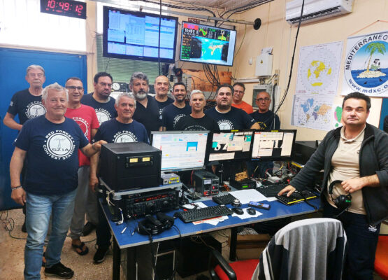
To this purpose, the Association of Radio Amateurs of Western Greece – ERDE and more specifically Kostas SV1DPI and Vasilis SV1DPJ, have set up and maintain at the station of SZ1A (Kokkinologos) a REDPITAYA SDR RX – Windows Server – CW SKIMMER & RBN Aggregator with concurrent reception at 80 – 40 – 30 – 20 – 15 – 10 meters! The antennas are an A3S with the 40m kit, which points permanently towards Europe-America, and a dipole for the 80. Their plans are to soon setup a vertical antenna. Charts are produced every week and stored in the web site [6]. In fact, there is a long history of previous reports, for further evaluation over long term.
If someone wishes to set up their own system, first devote some time to studying the first phases of this project [6] and then contact me.
There are several questions answered by the charts. Some were mentioned in the first paragraphs of the article and existed from the beginning of this project. Other answers were given along the way, simply by studying them. Like that FT8 can’t give openings better than CW – only add a small amount of extra time when a band opens and closes. They talked about signal passages that should not exist theoretically, and perhaps an operator could not find & use them firsthand. They associated solar activity with HF propagation using practical rules, gave an initial assessment of the evolution of propagation. And surely data can give even more answers!
However, there are some parts in the analysis for which enough attention should be paid to ensure that results are valid. First of all, SKIMMER system should operate 24×7 and for at least 15 consecutive days. Also validating the normal operation of the Software – Hardware – Antenna set for SKIMMER should be done at regular time intervals. Then, during contest periods the load on the computer processor running the SKIMMER can be twice that of a typical day. Of course, the hardware of the SDR receiver should be reliable and equivalent to the performance of at least one moderate superheterodyne HF transceiver. All precedents must be taken into account so that recorded spots can provide reliable charts or simply answers! Lastly, the probability of logging an incorrect spot is always countable, even in a normal operating system.
This whole project has already provided valuable results, and it can evolve even further. As in the case for verification of the correct HW & SW operation, where the use of a local CW beacon with minimal power will generate specific spots for evaluation during analysis. Or the integration of solar SFI – K – A indexes, as well as Flux – CME event in the charts. The use of statistical methods to fill blank spots in tables when for some reason the SKIMMER system was down. Even additional data processing with Machine Learning techniques! And finally, its implementation in a programming environment with more mathematical calculation capabilities such as MATLAB, (for example find in each graph the slope for the curve – line per hour).
REFERENCES
- [1] http://www.dxatlas.com/CwSkimmer/
- [2] http://www.reversebeacon.net/
- [3] https://groups.yahoo.com/neo/groups/ViewProp/info?guccounter=1
- [4] http://www.dxatlas.com/
- [5] https://www.physics.princeton.edu/pulsar/k1jt/wsjtx.html
- [6] https://www.qsl.net/sz1a/skimmer/
- [7] https://sv1cdn.weebly.com/skimmeranalysisgr.html